New Release: Pocket Bobina Brings In Pocket Functionality
In mid-1950s’ Czechoslovakia, the Škoda 12E electric locomotive took the recently upgraded railway lines by storm and quickly became the symbol of a new, faster rail era in the country. Seeing as we name our product versions after significant rail vehicles, the class that subsequently earned the nickname Bobina became our inspiration for this release of the TravelSupport website and the app that powers it under the hood. Just like its historical counterpart, our technology also underwent several stages of improvements, through versions named Bobina 0 and Bobina 1, until we reached the final iteration on January 31st. It’s main focus is on phones, tablets and handheld devices in general – a pocket release, if you will. That’s why we call it Pocket Bobina—just like the actual Class 100 narrow-gauge loco.
More Time on the Go
When we first launched TravelSupport in 2015, it was narrowly focused on a limited set of goals – mainly powering conference logistics and business events, which are naturally better managed on a large screen. However, as we reach out to more and more individual travelers, the need for a mobile-first experience becomes much more pressing.
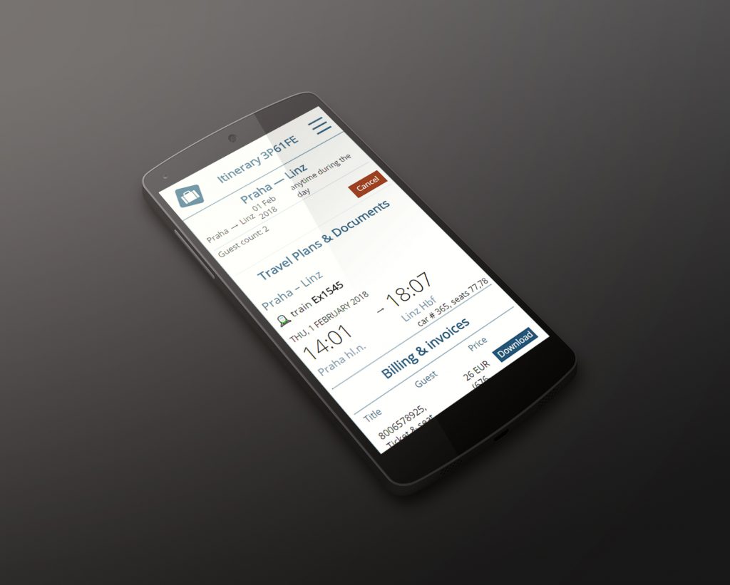
That’s why the new version heavily focuses on how we present detailed information on various displays, from a tiny phone screen to a large HD panel. Schedules, service details and bookings become front-and-center in our new app layout, with all the visual space needed to convey this information in a friendly way. It’s meant to provide the traveler to everything they need, at a glance.
Details Set in Context
We’ve come to understand quite strongly that different phases of travel planning require vastly different information. That’s why we now full prioritize our conversation with the customer during the actual planning, and we even de-cluttered the conversation view to only show the most recent developments first, while all older messages are available at a single tap or click. Our chat with the customer is now the center point of the itinerary view, so that everything important is immediately visible and no detail falls through.
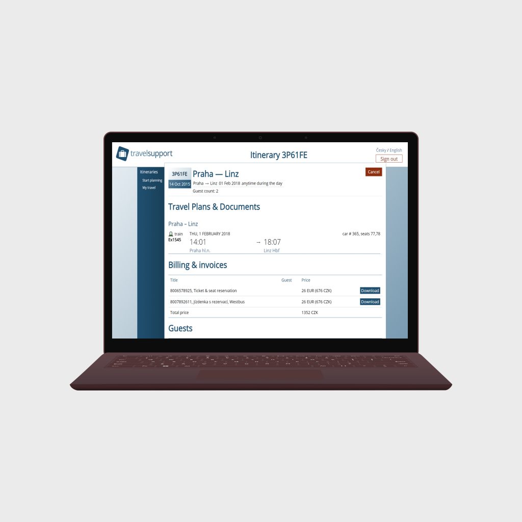
On the other hand, as soon as we finalize a travel plan and you’re ready to set out, the itinerary page rearranges to focus on the journey first and foremost. Our customers get to view their schedule and bookings right at the top, to make finding vital information easier and avoid the need to scroll. That way you can quickly check your departure time, open up your ticket or check the payment receipt.
Right after the key travel data, we also show recommendations and remarks by our travel experts to provide useful tips on your trip. Our entire communication history is still available, of course, just moved to the bottom.
Links Are More Alive
There are times when posting a link to a website takes care of matters better than long-winded explanations and descriptions. We’ve therefore improved the way we handle links in our messages and travel tips. Long and complex URLs are now handled more reliably, and are even shortened on the fly to cut down on unnecessary distractions.
More formatting tools are also available when writing a message, so that we can better communicate complex information that needs clarity, such as departure and arrival times. We even save unsent messages locally, in case something happens with your session.
Friendlier Localization
Transportation people love standardization. At the same time, it’s important to appreciate that even trivial things, such as displayed dates and times, can be confusing when not presented properly. In this version, we’ve taken extra care to format critical dates and times based on the user’s chosen language and locale. We’ve also added small touches, such as localized day and month names, to make important bits understandable at first glance.
Straightforward Billing
Our business clients value clear and concise billing information that doesn’t add extra complexity to their processes. Everyone, however, appreciates clear and legible billing statements and receipts, and so we’ve focused on just that. Changes were made both under the hood and in the UI to enable us to process different currencies seamlessly. We can even combine line items in different currencies for international purchases.
TravelSupport en español
Czech and English have been our default languages from day one. Now, we want to bring better European travel planning to a new audiences in Latin America and the Iberian peninsula. Even though Spanish content is still a work in progress, the entire TravelSupport app now fully supports the language and can easily present an entire itinerary in Spanish.